
Muse Walk
Muse Walk
UI/UX Design
UX Research
Product Design
Branding
Overview
MuseWalk is a gentle nudge to slow down, look around, and find beauty in the everyday.
Born from my love of mindful moments, creativity, and outdoor wandering, this app invites people to take intentional walks and capture what inspires them along the way - without pressure or performance.
I created MuseWalk during a UI/UX course as a space to explore how digital tools can actually bring us closer to our physical world, not pull us away from it. It’s part reflection, part creative outlet, and a product of my passion for crafting thoughtful, intuitive experiences that help people feel more connected to themselves and their surroundings.

The Problem Space
Problem Statement
Many people struggle to take time for mindful outdoor activities due to busy schedules, lack of motivation, and excessive screen time. This disconnect from nature can impact well-being.
Observation
I saw this in myself and my peers - especially those working remotely. We wanted to walk more, but often lacked purpose to get out the door. I wondered: what if a phone app could gently guide us outside, not distract us from it?
Opportunity
What if a mindful walking app made going outside feel meaningful - and creatively fun and inspiring?
Understanding Competitors
Review existing apps focused on related themes to identify the strengths, gaps, and the unique selling points of this app.
Mindfulness Apps
(e.g., Headspace, Calm)
These apps focus on guided meditation, but they often lack interactive prompts, or a creative component, especially for outdoor engagement. My app stands out by combining mindfulness with physical activity and creativity.
Photography Challenge Apps (e.g., GuruShots)

Apps that encourage photo challenges tend to emphasize competition. My app instead focuses on personal exploration and mindfulness, which may appeal to users who aren’t interested in social competition.
Photography Apps
(e.g., Instagram, VSCO)
Does encourage photography but doesn’t include structured prompts or mindfulness elements. They could be used to encourage challenges and goals - but it is not a default feature and is more overwhelming of an app with too much distraction if the purpose is for mindfulness and being present.
Fitness Apps
(e.g., Strava, Nike Run)

These are usually step-focused, and emphasize physical activity but lack the creative and mindful approach. Some do have a feature for adding photos, but it is not a main feature of the app and more focus is put on metrics like distance and pace as goals.
Identified Differentiation
MuseWalk stands out by combining these three elements (physical/outdoor activity, mindfulness, and creativity) in an easy, straightforward way. It blends these into a single experience with daily prompts to encourage users to engage meaningfully with their environment, rather than focusing solely on metrics or being in their head.
MuseWalk emphasizes the value of experience over metrics, appealing to users who prioritize wellness and creativity over strict fitness or productivity goals.
The Approach
Understand individuals’ current relationship with mindfulness, going outdoors and movement goals, and creative expression. Aim to learn what motivates them to engage in these activities and identify barriers (e.g., lack of time, structure, motivation).
Objective
Understand individuals’ motivations and challenges with physical activity, outdoor time, mindfulness, and creativity
Method
In-depth Survey (7 participants)
Competitor Analysis
Target Audience
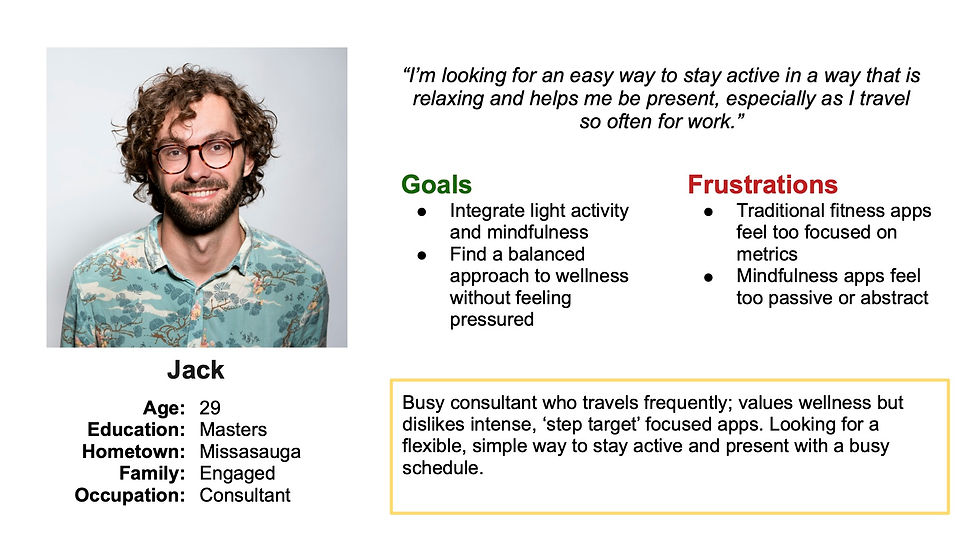
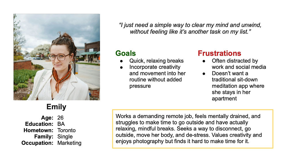
Young adults balancing busy schedules and wellness goals
Conducting User Research
In-depth surveys were conducted with our target audience to get a more thorough understanding of their needs, motivations, pain points, and current habits.
What drives you to seek mindfulness or creative outlets?
How often do you currently engage in mindful outdoor activities, and what barriers do you face?
What goals do you have for daily movement and what inspires them?
What We Heard
Individuals struggle to find time and motivation to get outside, practice creativity, and foster mindfulness in a rewarding way. People desire an incentive which prompts and inspires them to move.
"I find that I am never motivated enough or held accountable for staying with it and continuing."
- on mindfulness
"I work freelance from home so I don't usually have a reason to go outside. Just setting the goal to get outside but having nowhere to go unless I spend money doesn't help."
- on getting outside
"I don't want it to be like a checklist item of something I 'have to do everyday' but instead something that I am excited to do and want to do."
- on daily habits
Creating Identities from Research: User Personas
User Personas were crafted to reflect the target audience, based on research on user habits, needs, motivations, and competitors.

Understanding the User: Analyzing Findings
Affinity diagrams, HMW questions, 5 W techniques were used to analyze the results from our research to understand the user more and find an effective solution.
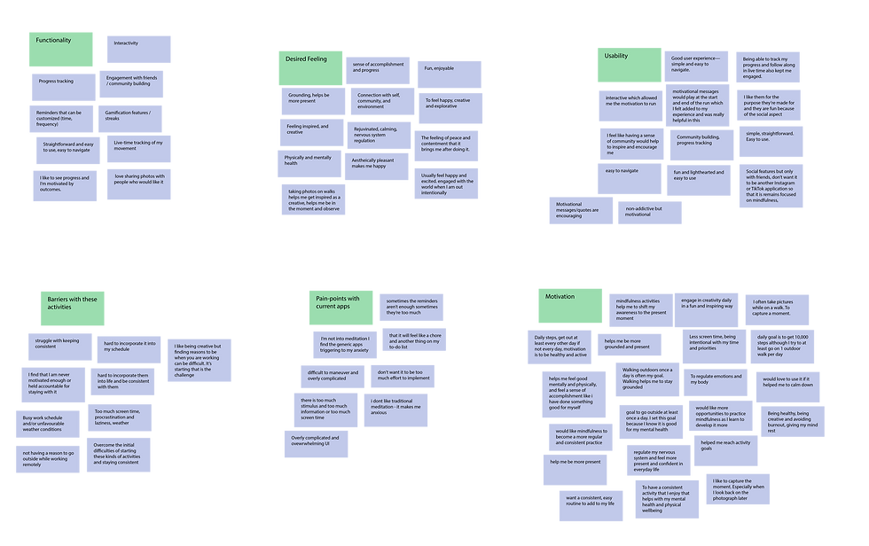
Parsing The Insights
An affinity diagram was created from the survey results, with clusters coming together naturally after deciphering key points and phrases from competitor research, user research, and brainstorming. This led me to find lots of information about barriers with these activities, pain points with current related apps, their motivation for these activities, usability wants, functionality wants, and the desired feeling from this app/these activities.
Actionable Insights
Taking insights from the research to shape the functionality and usability of the app.
Insight
Design Response
Users struggle to stay consistent
Daily prompts, gamification, customized reminders and progress tracking tailored to personal goals
Users want to feel a sense of accomplishment without too much pressure
Ability to customize personal goals, turn on different badges/streaks and see their history
Users want to feel a sense of community without overwhelm
Friends, not followers. Emphasis on the individuals' goals and prompting a walk
Users want a targeted and simple experience
Ensuring a simple and minimalistic feel to the app, focused on the task at hand
From Insights to Experience: Mapping the Main User Flow
After identifying that daily prompts would motivate consistent engagement, I designed the main user flow around completing one. This task is the heart of the app.

User opens app to the start walk page, viewing prompt immediately
Optional step to write a reflection
Data from the walk (e.g., time, distance, photos taken) is collected if enabled
Designing the App's Structure: Information Architecture
I wanted the app to feel calming and easy to navigate. Based on user needs, I structured the app into a minimalistic user experience with only three core tabs: Home (social & inspiration), Record (for walks), and Profile (for past entries and personal progress).

From Sketches to Screens: Lo-Fidelity and Visual Design
I began with low-fidelity wireframes to map out the core structure of the app - focusing on the main navigation and user flow around the daily prompt experience.


Kept layout minimal to reduce distractions
Placed Start Walk CTA front and center for clarity
Visual Design Identity
To reflect the app’s focus on mindfulness and creativity, I developed a visual identity that feels gentle, encouraging, and grounded in nature. The colour palette uses soft, harmonious tones - sage green, amber, and dusty blue - chosen to evoke calm and spaciousness without feeling clinical. These are paired with subtle gradients that add warmth and fluidity to the interface.
The Colour Palette
The colour palette was designed to balance calm and creativity - a visual reflection of the app’s focus on mindfulness and inspired action
-
Sage green and muted blue were chosen for their grounding, natural feel - evoking the serenity of outdoor environments and encouraging a sense of harmony
-
The warm amber acts as a visual spark - adding energy and playfulness to key moments and UI elements. It was intentionally used to invite a gentle sense of motivation, creativity, and momentum

Each colour was selected to support a different emotional state
Calm (green/blue)
Creative energy (amber)
Gradients blend these tones throughout the interface, adding depth and softness while reinforcing the calming, immersive feel
Sense of movement (gradients)
Hi-Fi Design, Prototyping, and Usability Tests
The next step was to create high-fidelity designs utilizing the visual identity crafted, and turning it into a functional prototype. To validate the design and improve on initial assumptions, I conducted moderated usability testing using this high-fidelity prototype.

User-Testing Script
During the moderated usability sessions, I asked participants to complete realistic tasks based on common app usage scenarios. I encouraged them to think aloud while navigating the prototype and followed up with open-ended questions to explore their impressions and pain points.
Some of the key tasks included:
Locate and read today’s photography prompt
Start tracking a walk and record progress
View past recorded activities
Key Observations & Takeaways
User testing confirmed that the app’s overall flow felt intuitive and calming, but it also surfaced areas where visual clarity could be improved. One of the key takeaways was the need for more visual hierarchy and dimension at the top of each screen - especially around headers and page transitions. Based on this, I introduced subtle background gradients and accent colours to bring more warmth, focus, and polish to the interface.

