
Bloor-Avenue Chiropractic
Bloor-Avenue Chiropractic
UI/UX Design
UX Research
Digital Strategy
Visual Identity
Overview
Bloor-Avenue Chiropractic approached me to help modernize their digital and visual presence to attract new clients and better reflect the professionalism of their services.
I led a complete website redesign to improve user experience and visual consistency, refined their brand identity across digital and print formats, and now continue to support their growth through SEO and social media marketing. This ongoing collaboration reflects my ability to create cohesive, client-centered design solutions across multiple platforms.


The Problem Space
Problem Statement
Bloor-Avenue Chiropractic needed a refreshed brand identity and website that felt modern, easy to navigate, and capable of attracting new clients.
Observation
The existing website lacked clear hierarchy and visual cohesion, making it difficult for users to quickly understand services or take next steps. This created friction in building trust with potential patients.
Opportunity
Redesign the brand and website to create a cohesive, user-friendly experience that improves clarity, supports trust, and guides users smoothly from first visit to booking.
The Approach
To ensure the redesign aligned with both business goals and patient needs, I began by developing a clear understanding of the clinic’s vision, users, competitors, and existing digital challenges.
Understanding the Clinic and its Patients
I held discovery conversations with the clinic’s owners to understand their goals for the rebrand and website redesign. Through these discussions, it became clear that BAC wanted a digital presence that felt modern and professional, while still conveying warmth, trust, and approachability.
Key priorities included:
-
Clearly communicating services
-
Highlighting the clinic team
-
Creating a seamless experience for both new and returning patients
To better understand the patient perspective, I also reviewed existing reviews and testimonials to identify what users valued most about the clinic.
Defining the Problem
To identify opportunities for improvement, I conducted a full audit of the existing website.
Findings included:
-
Over 20 disorganized pages with unclear hierarchy
-
Usability issues that made information difficult to find
-
Content that overwhelmed users and diluted key messaging
I complemented this with a competitive analysis of similar chiropractic clinics to benchmark design standards, site structure, and SEO practices.
Strategic Direction
Insights from research were synthesized into clear content and structural goals that guided the redesign:
-
Simplify navigation and reduce page overload
-
Clarify service offerings and user pathways
-
Retain, rewrite, or remove content to improve clarity and flow
This process established a strong foundation for restructuring the site into a more intuitive and user-centered experience.
The Old Website
The original website presented significant challenges in clarity, hierarchy, and navigation.


Understanding Our Competitors
Review existing apps focused on related themes to identify the strengths, gaps, and the unique selling points of this app.
Mindfulness Apps
(e.g., Headspace, Calm)
These apps focus on guided meditation, but they often lack interactive prompts, or a creative component, especially for outdoor engagement. My app stands out by combining mindfulness with physical activity and creativity.
Photography Challenge Apps (e.g., GuruShots)

Apps that encourage photo challenges tend to emphasize competition. My app instead focuses on personal exploration and mindfulness, which may appeal to users who aren’t interested in social competition.
Photography Apps
(e.g., Instagram, VSCO)
Does encourage photography but doesn’t include structured prompts or mindfulness elements. They could be used to encourage challenges and goals - but it is not a default feature and is more overwhelming of an app with too much distraction if the purpose is for mindfulness and being present.
Fitness Apps
(e.g., Strava, Nike Run)

These are usually step-focused, and emphasize physical activity but lack the creative and mindful approach. Some do have a feature for adding photos, but it is not a main feature of the app and more focus is put on metrics like distance and pace as goals.
Identified Differentiation
MuseWalk stands out by combining these three elements (physical/outdoor activity, mindfulness, and creativity) in an easy, straightforward way. It blends these into a single experience with daily prompts to encourage users to engage meaningfully with their environment, rather than focusing solely on metrics or being in their head.
MuseWalk emphasizes the value of experience over metrics, appealing to users who prioritize wellness and creativity over strict fitness or productivity goals.
Strategic Direction
Insights from research were synthesized into clear content and structural goals that guided the redesign. This process established a strong foundation for restructuring the site into a more intuitive and user-centered experience.
Simplify navigation and reduce cognitive overload
Clarify service offerings and user pathways
Rewrite, or remove content to improve clarity and flow
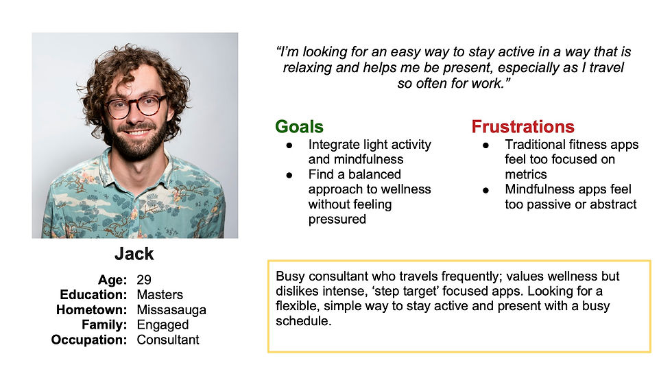
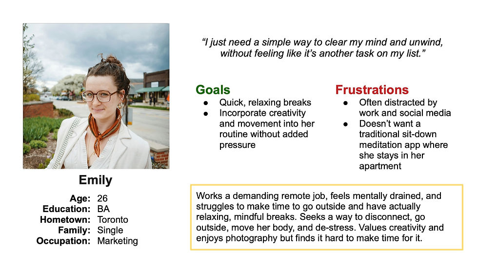
Creating Identities from Research: User Personas
User Personas were crafted to reflect the target audience, based on research on user habits, needs, motivations, and competitors.

Understanding the User: Analyzing Findings
Affinity diagrams, HMW questions, 5 W techniques were used to analyze the results from our research to understand the user more and find an effective solution.
Parsing The Insights
An affinity diagram was created from the survey results, with clusters coming together naturally after deciphering key points and phrases from competitor research, user research, and brainstorming. This led me to find lots of information about barriers with these activities, pain points with current related apps, their motivation for these activities, usability wants, functionality wants, and the desired feeling from this app/these activities.
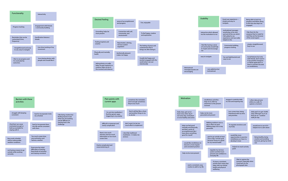
Actionable Insights
Taking insights from the research to shape the functionality and usability of the app.
Insight
Design Response
Users struggle to stay consistent
Daily prompts, gamification, customized reminders and progress tracking tailored to personal goals
Users want to feel a sense of accomplishment without too much pressure
Ability to customize personal goals, turn on different badges/streaks and see their history
Users want to feel a sense of community without overwhelm
Friends, not followers. Emphasis on the individuals' goals and prompting a walk
Users want a targeted and simple experience
Ensuring a simple and minimalistic feel to the app, focused on the task at hand
From Insights to Experience: Mapping the Main User Flow
After identifying that daily prompts would motivate consistent engagement, I designed the main user flow around completing one. This task is the heart of the app.

User opens app to the start walk page, viewing prompt immediately
Optional step to write a reflection
Data from the walk (e.g., time, distance, photos taken) is collected if enabled
Content & Structure Strategy: Information Architecture
Based on research, competitor analysis, and site audit findings, I proposed a streamlined one-page website structure to reduce friction and simplify the user journey.
A clear content hierarchy was developed to guide users to key information quickly, prioritizing:
-
Contact and location details
-
Team introductions
-
Service clarity
-
Booking access
This structure reduced overwhelm and created a more intuitive flow from arrival to action.
From Sketches to Screens: Lo-Fidelity and Visual Design
I began with low-fidelity sketches, followed by mid-fidelity greyscale wireframes to map out the core structure of the website. Focusing on prioritizing content hierarchy in order to build authority, trust, and expertise while informing visitors about the services available.


Visual Design Identity
Working closely with the clinic owners, I refined the visual direction of the brand while respecting their desire to only slightly modify the existing logo.
The Colour Palette
The result was a unified visual language that better reflected the clinic’s personality and values.
-
Refined and formalized the brand colour palette, defining specific hues and hex codes for consistent use across platforms
-
Developing a cohesive palette that balanced professionalism with warmth
-
Establishing a typography system for consistency across digital and print touchpoints


Hi-Fidelity Design & Validation
I translated the approved structure and visual direction into high-fidelity desktop and mobile designs in Figma, building interactive prototypes that closely reflected the final website experience.
These prototypes allowed stakeholders to review realistic flows and interactions before development, making feedback more concrete and actionable.

Feedback & Usability
I gathered structured feedback from the clinic owners and conducted lightweight usability testing with a small group of users to evaluate clarity and functionality.
Testing focused on core tasks, including:
Finding service information
Understanding practitioner offerings
Accessing booking and contact options
User behaviour and stakeholder feedback highlighted small friction points in navigation and content clarity.
Refinements
Based on findings, I implemented targeted refinements to improve flow, clarity, and interaction cues. While maintaining alignment with usability best practices and the approved visual direction.
Final Design
Launched a fully functional, optimized website that aligns with both user needs and clinic business goals.
The final site was developed in Wix Studio, with responsive layouts designed across three breakpoints (desktop, tablet, and mobile) to ensure a consistent experience on all devices.


Post-Launch Iteration & Optimization
Following the initial launch, I continued collaborating with the clinic to refine and expand the site based on evolving needs and performance goals.
These updates improved content clarity, mobile usability, and search visibility, while giving each practitioner a stronger, more credible presence online.
Key Improvements
Adding individual practitioner pages - strengthening expertise, trust, SEO performance while supporting informed decision-making of patients
Expanding service descriptions for better comprehension
- Enhancing mobile responsiveness micro-animations
Adding internal linking - assisting with SEO and retention

Brand Identity & Print Design
Goal: Extend and unify the clinic's updated visual identity across all touch points
-
Refined the existing logo by modernizing the colour for better versatility and brand cohesion
-
Developed a cohesive visual system including a professional yet welcoming colour palette and type hierarchy
-
Designed branded business cards, internal office signage, and appointment cards that visually aligned with the updated website
-
Ensured all print materials communicated trust, care, and professionalism - consistent with the clinics tone and values


Digital Marketing & Social Media
Goal: Strengthen BAC's online presence and improve visibility through strategic content and SEO
-
Provide ongoing SEO services to optimize on-page content and improve search engine rankings
-
Created a content strategy and social media posting on their desired schedule to engage their audience and highlight services and wellness tips
-
Designed custom visuals for posts, reflecting the brands tone
-
Wrote clear, approachable copy tailored to both new and existing clients, improving reach and engagement across platforms
-
Ensure all social media content reinforces the clinics identity and builds trust with the target audience


![Think chiropractic care is just back cracks and never-ending appointments?
Let’s set the record straight. 🧠✨
We hear these myths all the time - so we’re breaking down 6 of the most common misconceptions about chiropractic care and what’s actually true 👇
🔹 Myth: Chiropractors only treat back pain.
Fact: They’re trained to treat the whole musculoskeletal system - think headaches, joint issues, extremity pain, and more. Plus, they offer guidance on posture, exercise, and lifestyle.
🔹 Myth: Once you start, you’re stuck going forever.
Fact: You’re in control. Your care plan is based on your goals - whether that’s short-term relief, long-term wellness, or as-needed support.
🔹 Myth: Adjustments are painful.
Fact: Many people feel immediate relief. Techniques are safe, gentle, and precisely targeted.
🔹 Myth: It’s not safe for children or seniors.
Fact: Chiropractic care is adaptable for every age - newborns to grandparents.
🔹 Myth: Chiropractors only “crack” backs.
Fact: They do much more, like soft tissue therapy, rehab exercises, acupuncture, and personalized wellness strategies.
🔹 Myth: You need a referral.
Fact: Chiropractors are primary care providers. That means you can book directly - no referral needed!
💬 Still have questions? We’re happy to chat.
📍Visit our website [link in bio] to learn more or book your next appointment online.
#ChiropracticCare #ChiropracticMyths #BackPainRelief #WholeBodyHealth #HolisticCare #TorontoChiropractor #MusculoskeletalHealth #WellnessJourney #PainReliefNaturally #MobilityMatters](https://scontent-iad6-1.cdninstagram.com/v/t51.82787-15/504361298_18018704612716140_7771845478406886077_n.jpg?stp=dst-jpg_e35_tt6&_nc_cat=107&ccb=7-5&_nc_sid=18de74&efg=eyJlZmdfdGFnIjoiQ0xJUFMuYmVzdF9pbWFnZV91cmxnZW4uQzMifQ%3D%3D&_nc_ohc=o5f7fNLN6dIQ7kNvwEk_8et&_nc_oc=AdoC7N2GxIWKhueLqDUSBk6L3LXKZukigaEaDNkv_E7Nq_lWU4dxEAJU2lEKzGjVx4Q&_nc_zt=23&_nc_ht=scontent-iad6-1.cdninstagram.com&edm=ANo9K5cEAAAA&_nc_gid=AghnMA5jz5ZZC_TzpYKmXQ&_nc_tpa=Q5bMBQFsDpM5Du6nthIQ-hO86tSX0pbr1TVdkhfVy93fgvZvOU5npgSaWRlTEn2ttIIz_9TrW01ivpwv&oh=00_AQCKegKhmLkc2wECsKgcG9LuQ8ZkBkNMD4p6gS_jsaRYvg&oe=6A62BD45)


